What makes a great website great? When it comes to this question, non professional designers love to talk about big pictures, visions, and the grand feelings they wish the site has. Although big thinking does count, we, a professional team with over 18 years of web design experience, argue that detail matters much more.
We know that caring about details is a much harder job than boasting about big ideas, because it takes tremendous attention and constant struggles. Often times, it means our bottom line is affected. However, in YSD we believe a great website is only possible if we care enough about the tiny details. By looking at the following showcase, you know how much we care.
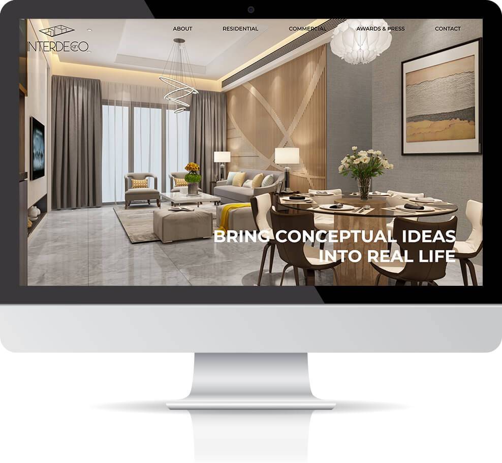
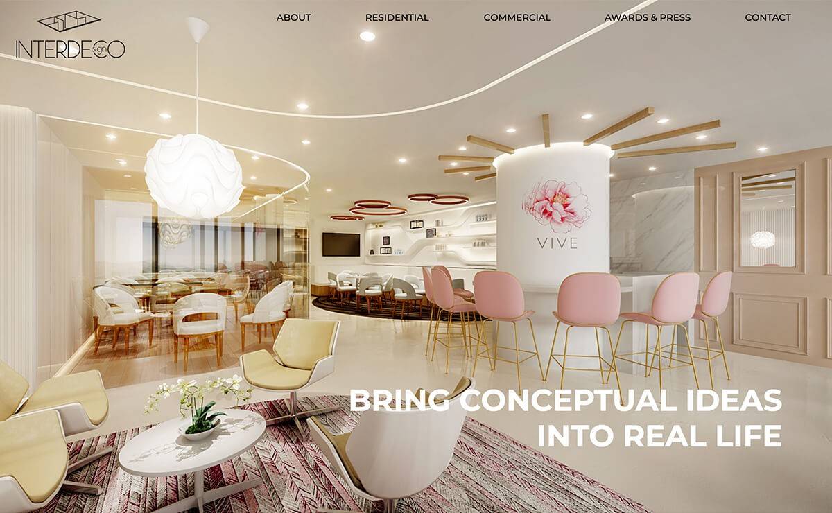
Interdeco Design Limited is one of our latest clients and also an award-winning interior design company in Hong Kong.
Like many other interior design clients, this client has numerous great projects to show.
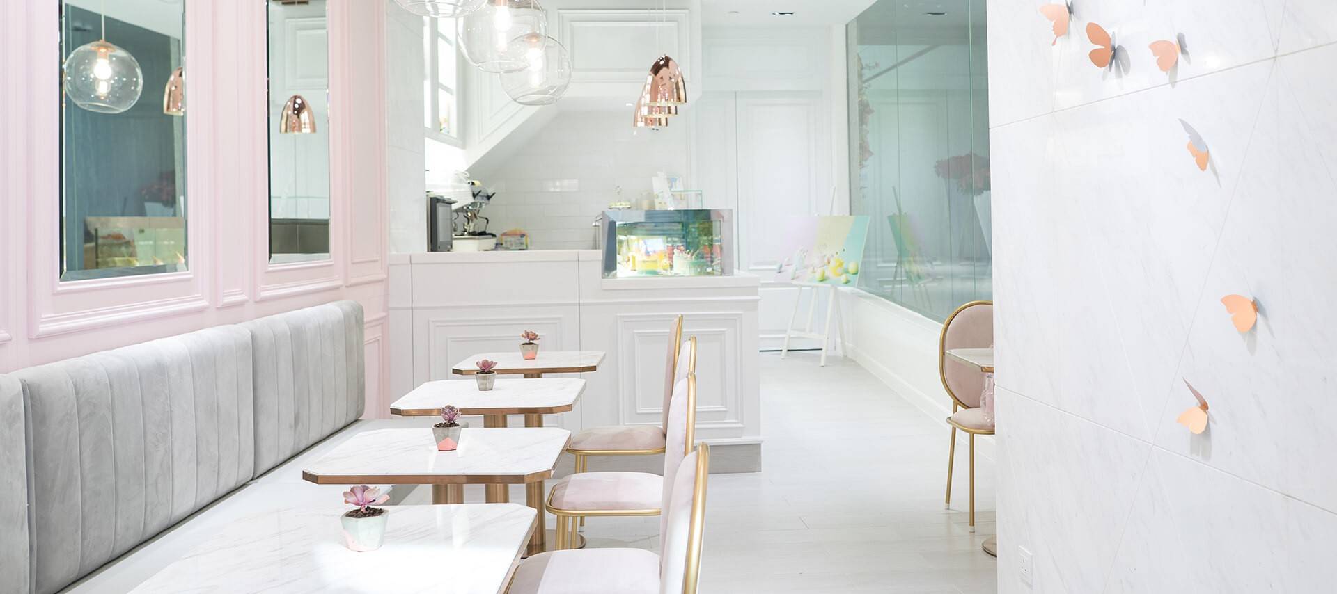
After reviewing their project images, we believe the images themselves are great. What they need is a significantly better way to present them, instead of listing them out 1 by 1. This is what drives us to focus our attention on crafting the details put around the images, as these details amplify the beauty of the project shots.
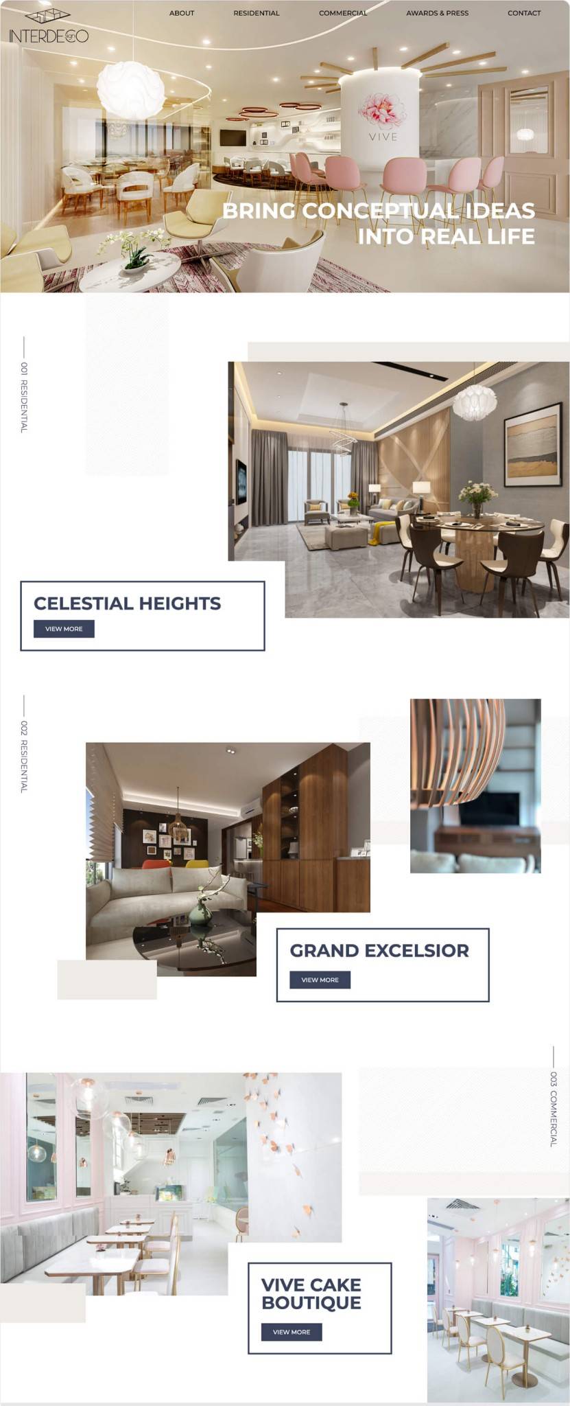
Starting from the Home page, we think of vertically placing the product category on left side. We believe the most important information in this site is the product image. Turning the text vertical makes it less distracting and people can focus on the images instead of the text.
When you scroll down, you should find grey layers and masks floating around project images and a lot of white space. These layers add surprises for the images and make the page layout less predictable, so that users are less likely to feel tired of seeing big banner images.
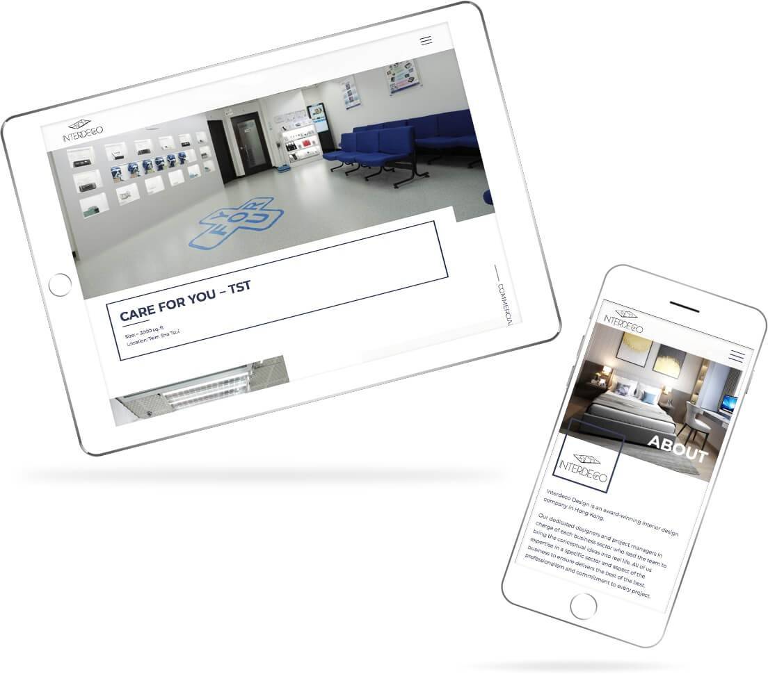
When you arrive in the project page, you should see project images sliding up only when users are ready to see. This detail makes the site more interactive and vivid.
We also mix up the presentation of project images. This is why in 1 project you see a centred banner image first, while in another you see two images sitting side by side. By mixing up the images, each project page is like a totally different story, and offers a refreshing feeling to user.
To sum it up, we believe by focusing on all these details, the details themselves construct the big picture, and bring us an exceptional website in the end.