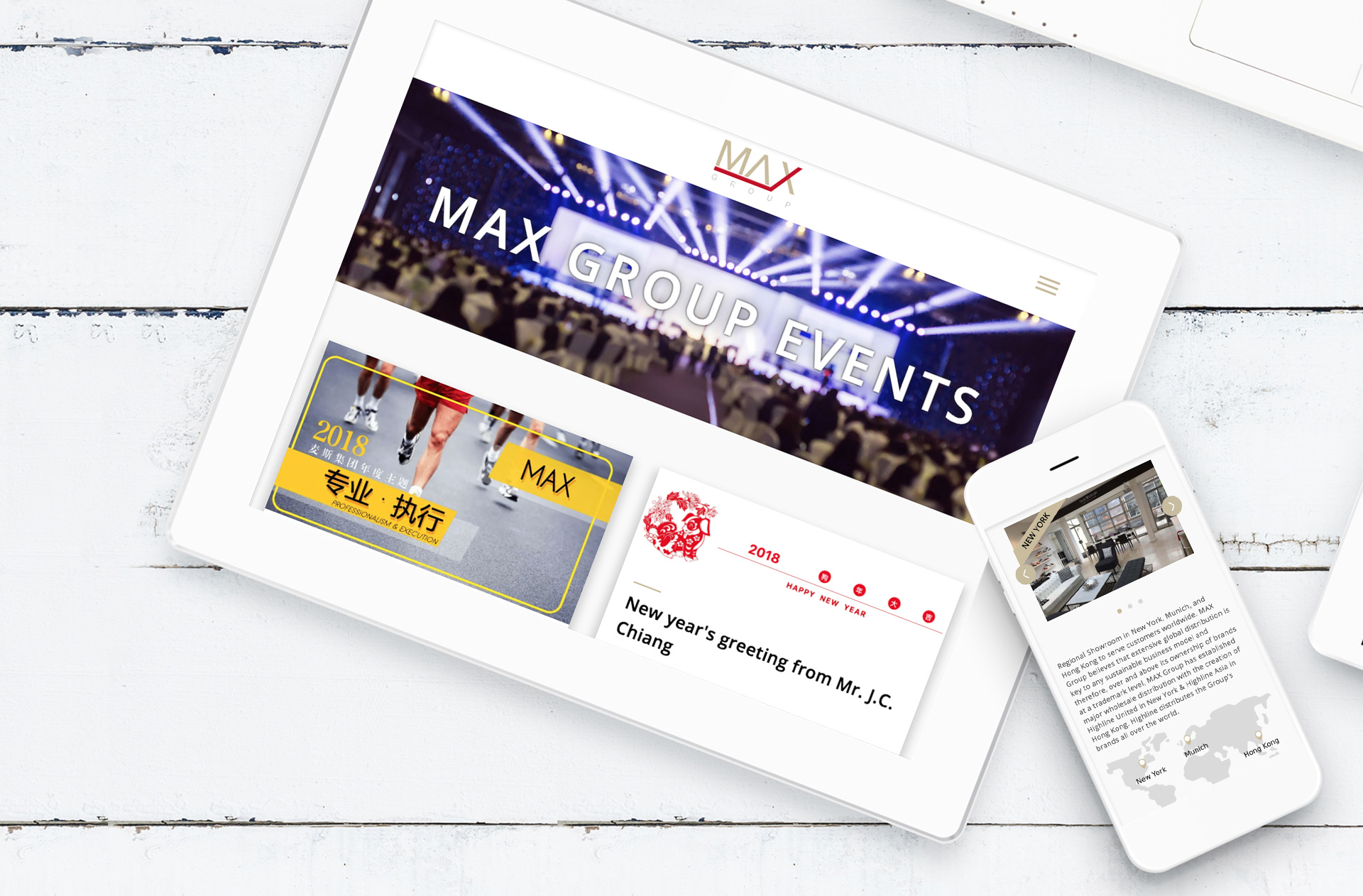
Max Group was founded as a trading company in 1994. Today, Max is a vertically integrated footwear company with business expertise and coverage ranging from design, product development, manufacturing, brand management, global distribution, retail channels and e-commerce, offering a one-stop shop services to our international partners.
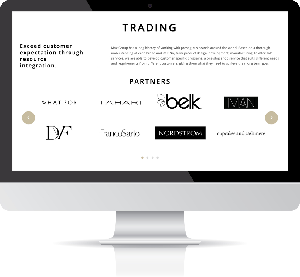
When this client first reached for our service, we discussed with them for long hours, because Max Group has long history and 5 industries groups to talk about in their website. The client, however, wants this website to look sleek and elegant, even with all these information and details to talk about.
This is not easy. This means we need to play clever in arranging contents.
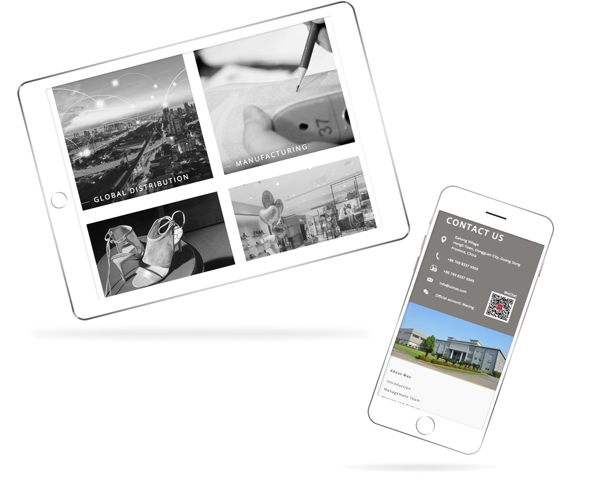
The first challenge we meet is to make it look sleek and light. We don’t to scare our website visitors away by putting a lot of texts in front of them. On the other hand, we cannot skip the texts, as they educate visitors about the cores of Max Group.

That’s why we reduce the number of colors we use in this site, so that visitors are less likely to be distracted by color, and more focused on the information.
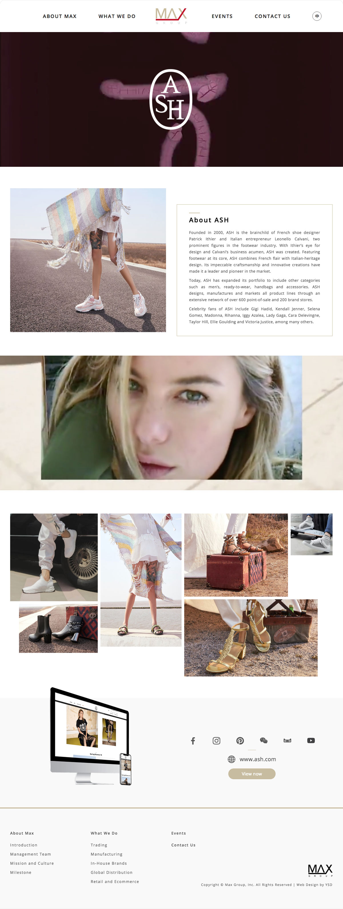
We also add in more white space around the words and between paragraphs. This means visitors can gain some rest when reading through paragraphs.
What’s more, we arrange photos and icons between words to make the content more digestible.

Our second challenge is to make the site look elegant, while maintaining its simplicity. After much consideration, we first design a parallax effect for individual brands, so that a brand image and introductory texts slide on top of a carefully framed and edited video. This adds a sense of elegance and dynamics to the pages.
When this website is finished, our client appreciates the design sense we bring to the table and our careful consideration, and we are proud of assisting our client to revitalise their much respected brand.

