Simple but bold.
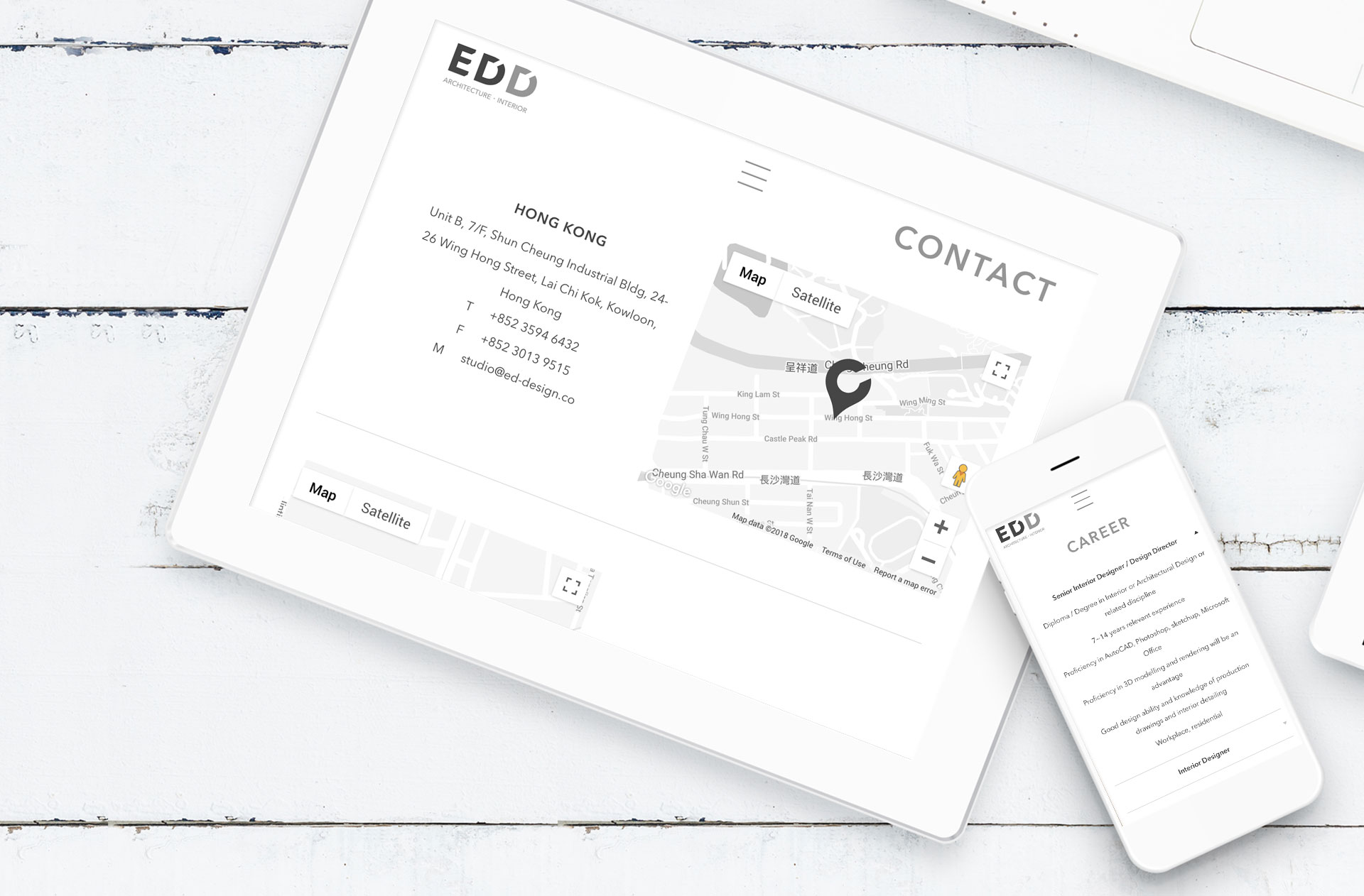
The making of EDD website is a story about being simple but also bold.
The client for this website project is an aspirational and promising architect who demands a simplistic looking website. However, being simplistic is not enough for this client. He also wants the website to show who he is and what he is about, a bold architect who is going to bring innovation to his field.
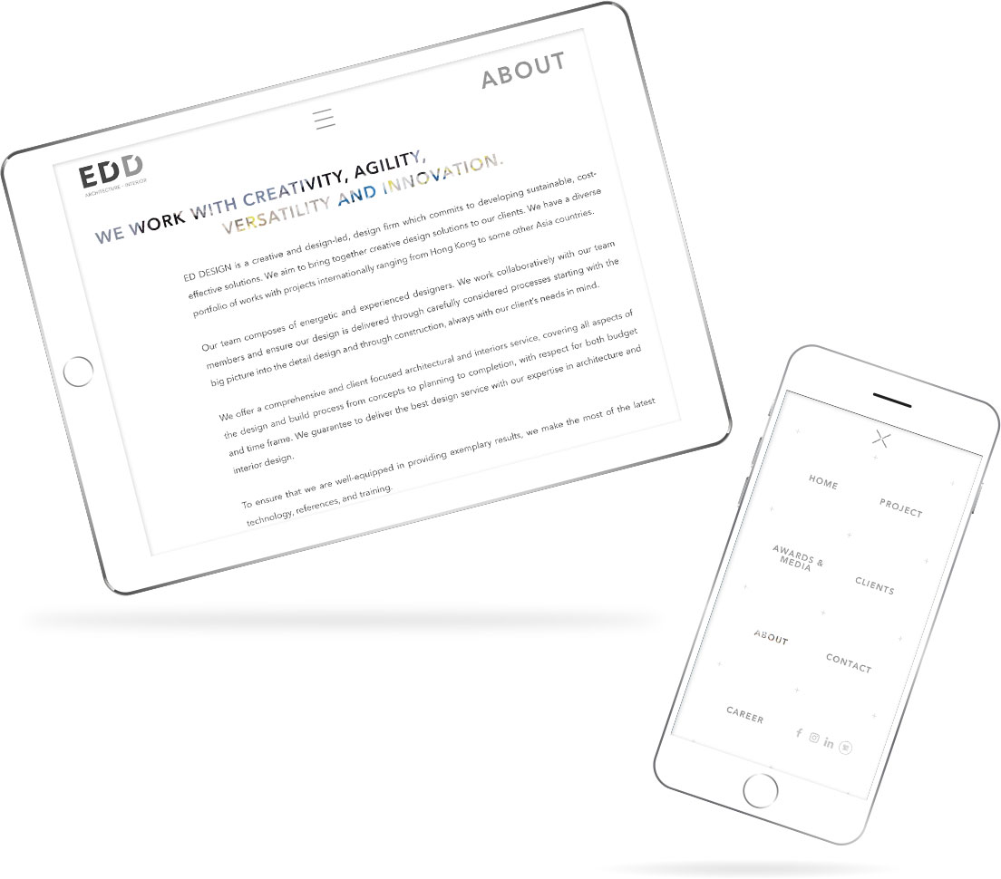
It’s hard to strike a balance between simplicity and boldness. And this is why we love this challenge.
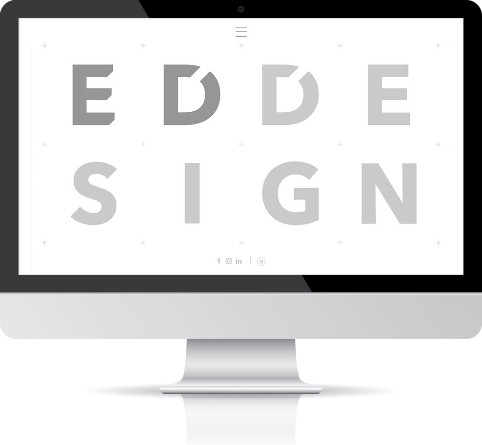
To achieve simplicity, our designers start this project with a blank sheet of paper and put in elements that are essential onto the paper. This is why there are only 8 elegantly positioned letters on the Home page. We want nothing more than the cores.
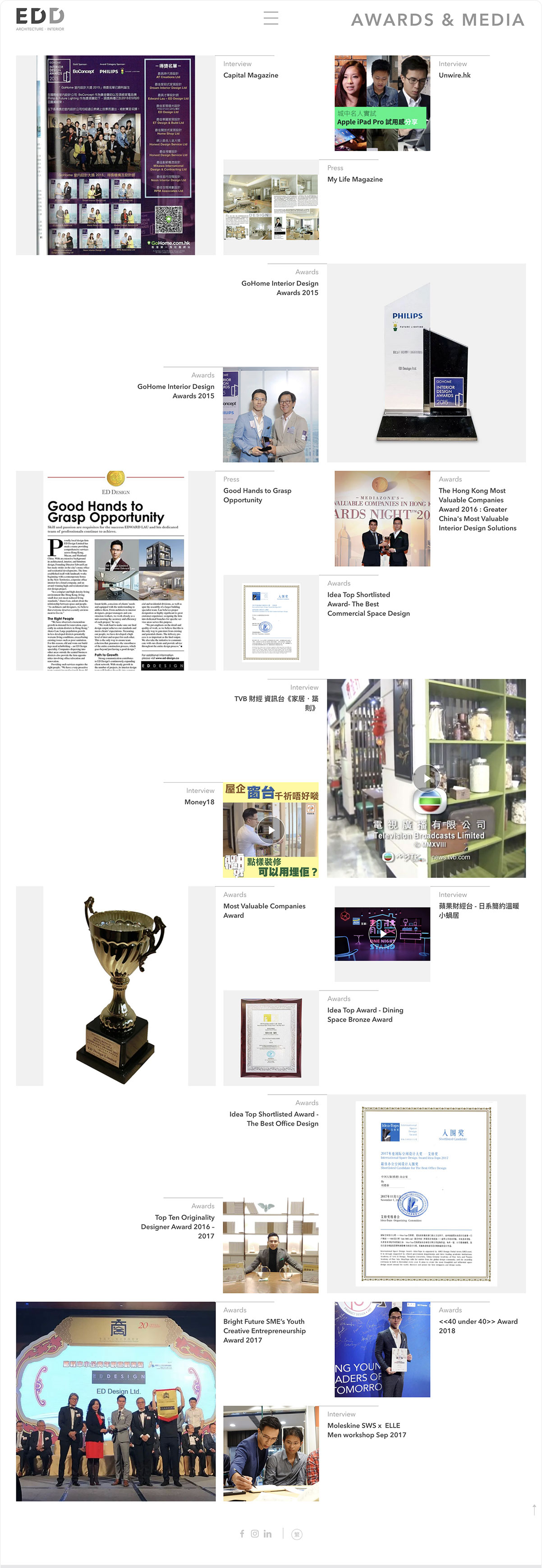
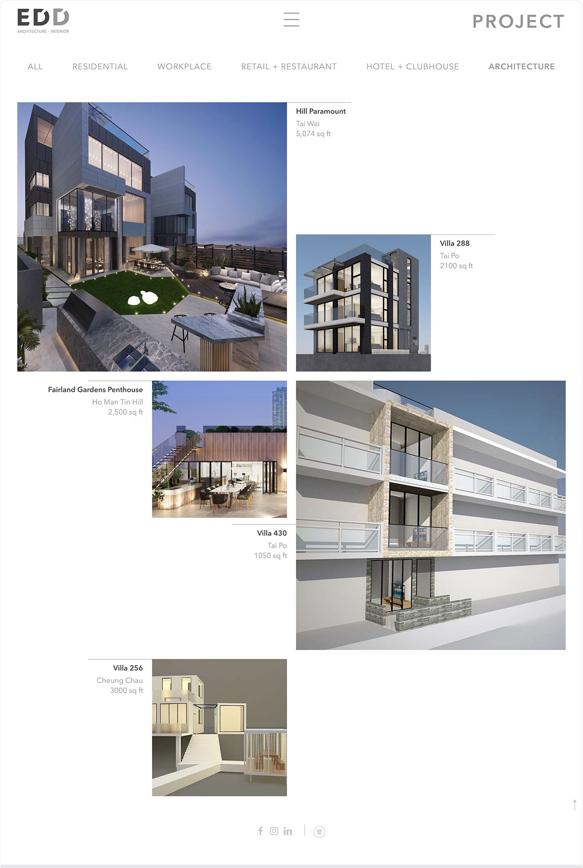
When you go through the project and awards pages, what you see immediately is a large area of white space, both outside and between the content area. The area is there because we want to provide more breathing room for visitor. We understand that users can feel overwhelmed when looking at too many images. This arrangement drastically improves user experience.

To achieve boldness, before starting the project, we know that clients’ project images are very eye-catching and splendid. The challenge lies in how to present them in an elegant way. This is why we design a squared pattern to accommodate the images. As you can see in the project page, the images are arranged consistently inside the pattern and this creates a smooth browsing experience for users, even if there are a lot of images.
The last point to stress about is that we deliberately reduce the number of page loading by skilfully using popups. This helps focus visitors attention on page content instead of being distracting by browser movement and page loading.
At the end our client is very proud of this site as his career portfolio.

