PESCA’s concept is to offer quality, effective, natural and organic skincare products yet at affordable prices.
But they got a problem. They did not know where to offer these products. After some research, they figured out that an e-Commerce website is the best media they could have, as it is highly customisable. With this store, they can promote their idea and build relationship with their customers.
This was why we could help these 2 clients.
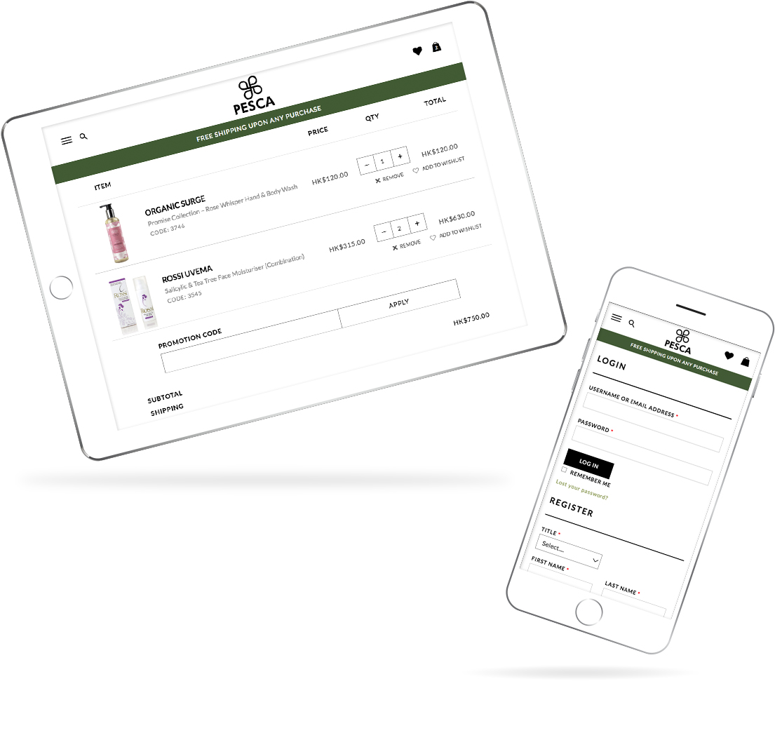
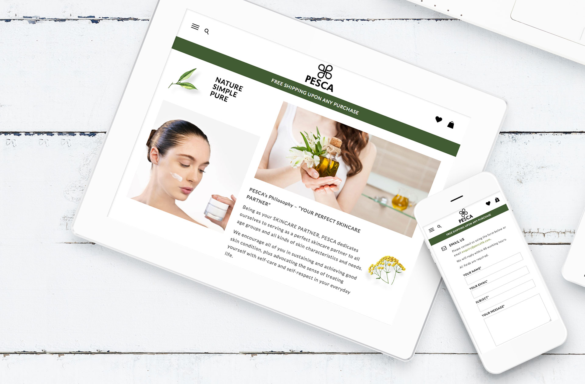
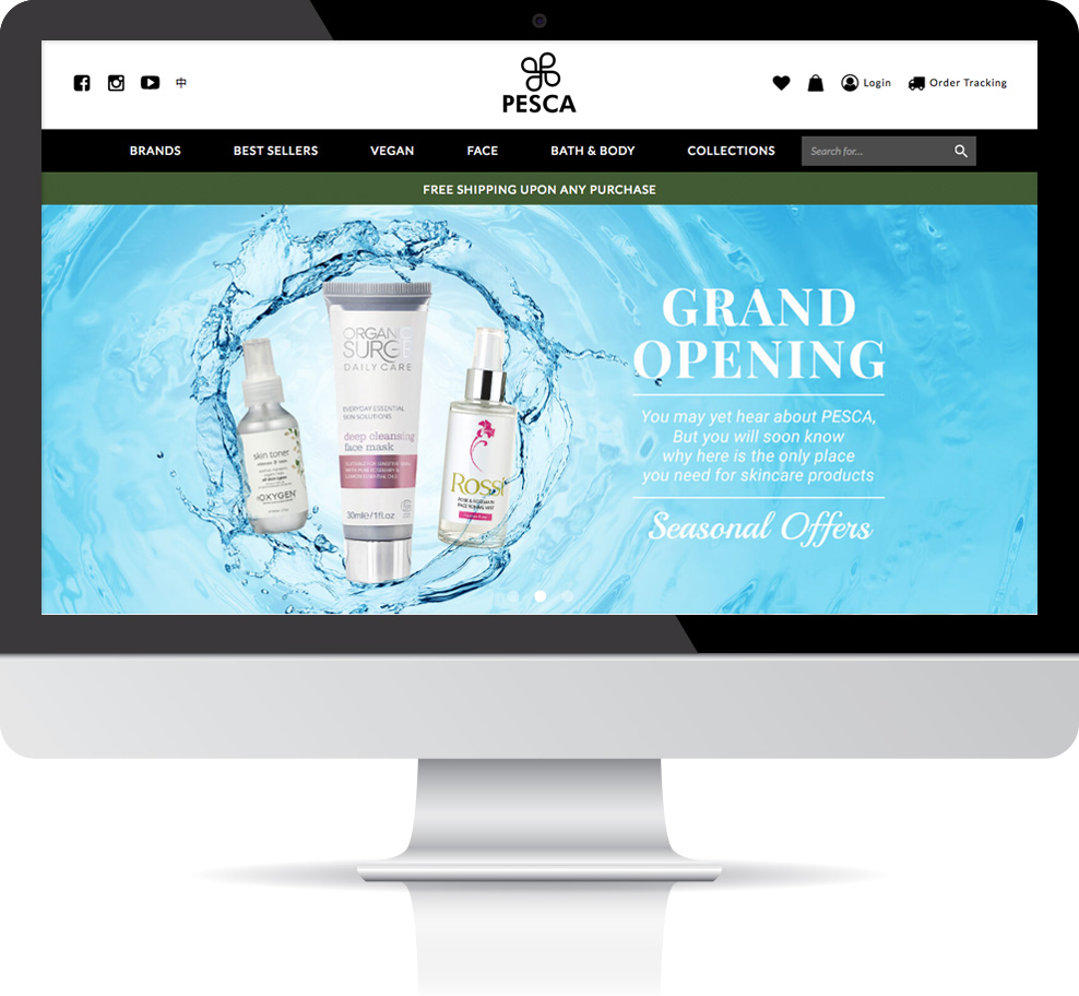
The clients came to us with very clear goals for this website: natural, simple and elegant. They want the site to look professional, yet friendly at the same time. These requirements are easier said than done.
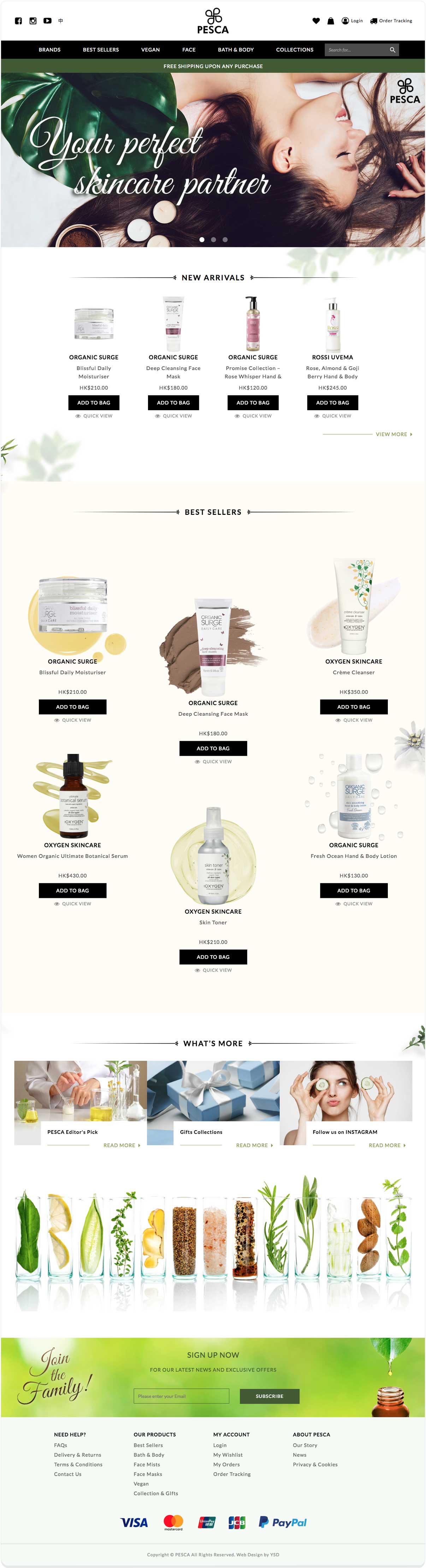
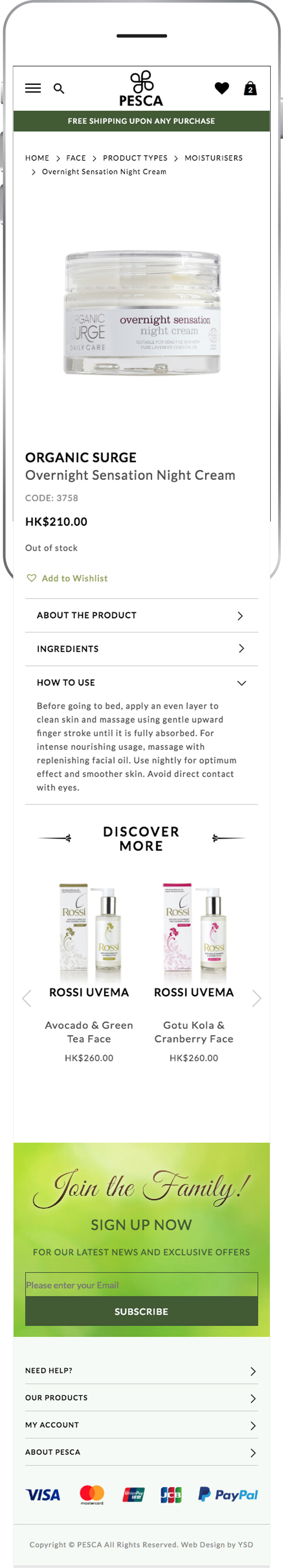
To achieve all these goals, we decided to employ a few colors: a greyish green, a light green, white, and black. The greyish green color offers natural, mature, and friendly feeling to viewers. The white offers the feeling of cleanliness and simplicity. The black signals a sense of professionalism. Together these colors make this site professional and approachable.
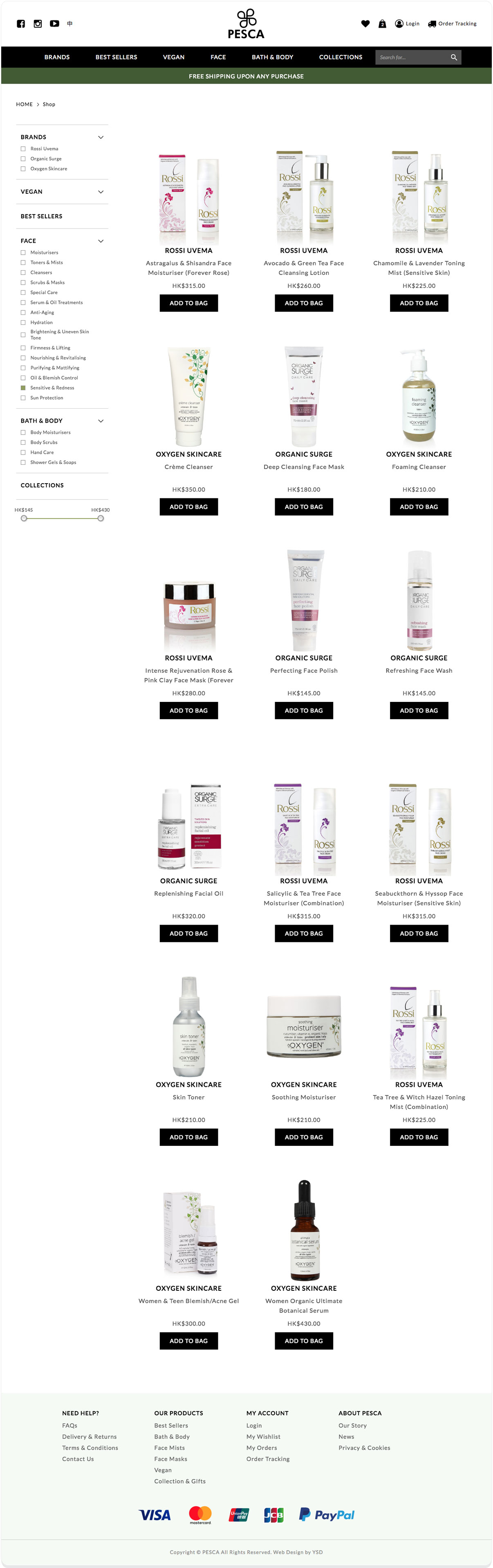
Aside from using appropriate colors, we use blurry leave backgrounds and flowery patterns on various spots. The blurry leave backgrounds offers floral, natural feeling, while the flowery patterns function as decorations for the products. With the help of these details, this e-shop looks minimal but not boring.
Apart from patterns, we also tweaked the website’s animation so that products slide in gradually and slowly. This subtle animation is very soft and makes the product look more grand and delicate.
One thing to note is that during the development of this site, we had arguments with these clients from time to time. But these were healthy arguments because we all had a common vision in mind: to make a remarkable skincare website. And we think we did it.